Saturday, December 09, 2006

Affordability is THE problem

There's been talk recently about a potential bottom in the local and national real estate markets. After all, the economy is still growing, mortgage rates are low, what could keep our local market from re-igniting? In a word - affordability. Prices in MA rose much faster than incomes for the last 7 years. Sure mortgage rates are low, but can't we figure in the effect of mortgage lending rates to see if they compensate for the high prices? I've assembled three plots from a variety of sources that attempt to do just this.

First up is data from "The Greater Boston Housing Report Card 2005-2006" available as a PDF from CHAPA (PDF here). Lots of great information available in the report, but let's focus on their affordability analysis. Here is their description of how they estimate the number (and percentage) of communities affordable to existing residents and new buyers throughout Massachusetts in 2005:

A municipality’s housing is considered “affordable” for this analysis if the annual cost of supporting a mortgage, real estate taxes, and homeowners insurance does not exceed one-third of the annual median income of households in that community. CURP also estimated the affordability gap for those unable to come up with a 20 percent down payment. Considered a “first time homebuyer” analysis, the calculation is the same but both the homebuyer’s household income and the purchase price of the home are estimated to be just 80 percent of the median for the community and the down payment is assumed to be 10 percent.

Note this analysis does not tell you anything about how affordable each community is, just how many communities meet their threshold of affordability. But also note that their analysis takes into account the prevailing mortgage rates, local taxes, and insurance. Here are the historical figures from their analysis:
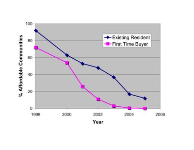
Clearly, we are reaching unsustainable lows when ZERO communities are affordable to "first time buyers," and ~10% are affordable to existing residents.


Next up is the National Association of Home Builders - Wells Fargo Housing Opportunity Index (available here). From their press release:


The NAHB/Wells Fargo HOI is a measure of the percentage of homes sold in a given area that are affordable to families earning that area’s median income during a specific quarter. Prices of new and existing homes sold are collected from actual court records by First American Real Estate Solutions, a marketing company. Mortgage financing conditions incorporate interest rates on fixed- and adjustable-rate loans reported by the Federal Housing Finance Board.

This analysis is similar to the CHAPA analysis above, except that it focuses more narrowly on the Boston area, looks at % of affordable homes (rather than communities), has data going back to 1991, and also somehow incorporates both fixed- and adjustable-mortgages into their "opportunity index."


High readings on the HOI index means greater affordability. From the NAHB data, it doesn't look like now is an "opportune" time to try to purchase a house in the Boston area.


Last up is an analysis performed by Moody's Economy.com, and featured on the NY Times website as an interactive graphics tool (link here). Plotted below is the % of income local buyers had to pay for mortgage costs (no taxes or insurance) to buy a house in three MA Metro Divisions since 1979. Again, their analysis takes into account prices, incomes, and finance costs.

The cost to service a mortgage in these areas is near or above the unsustainable levels reached at the last market top in the late 80's.
The fuel to make prices go higher is income available to support higher prices. According to all three analyses, this fuel is in short supply. That doesn't mean by itself that prices have to come down (although I think they will given the fundamental imbalance between supply and demand). But given that we are only slightly above historical lows in mortgage rates, there is very little room for inflation-adjusted prices to grow. Claims that "now is a good time to buy before prices rise" are ill-founded. There is not sufficient income to support higher prices.

Wednesday, November 29, 2006

October sales, prices, and inventory

MAR (here) and the Warren Report (here) recently released Massachusetts housing market data for October.

According to MAR: this October SFH sales were down 16.5% and prices were down 2% from October 2005; condo sales were down 17.6% and prices were down 3.7% over the same interval (see below for historical plots). While the decrease in sales is smaller than in the previous few months, keep in mind that last October was already a weak period so the comparisons are getting easier. In fact, single family home sales this year were off 23% from Oct. 2004, and 33% from Oct. 2003.

The Warren Report numbers, which are more inclusive, show SFH sales off 14.9%, and prices down 6.9%. Meanwhile, condo sales were off 19.5% and prices were down 4.8%.

Here are the historical trends for sales according to MAR data:


Here are the historical price trends, again according to MAR data:


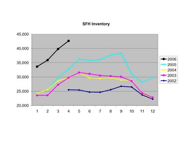
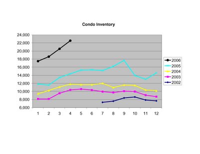
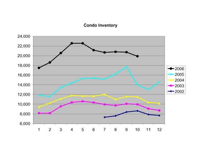
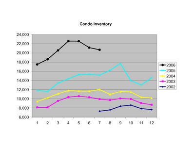
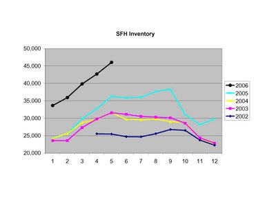
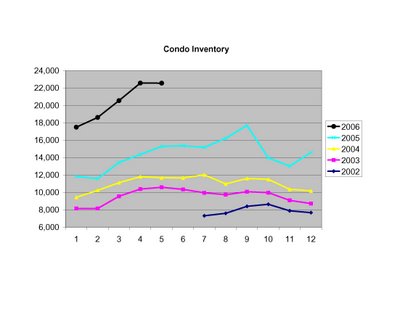
To put the current unsold inventory into perspective, here are the historical numbers according to MAR:


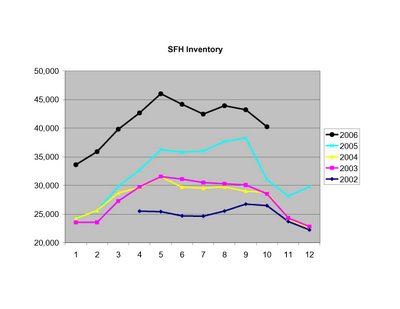
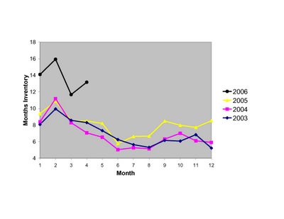
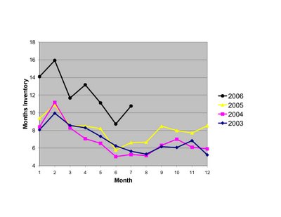
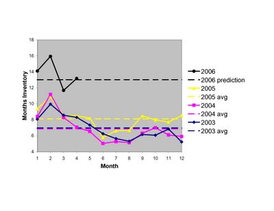
Finally, here is a look at months inventory (total SFH and condo inventory/total sales):


While certain parties continue to spin these numbers as best they can, Wellesley College housing economist Karl Case puts them into the proper perspective (House prices plunge): "All of the indicators - sales volume, prices, everything - are pointing downward."

Tuesday, October 24, 2006

Preliminary 3rd Q Analysis - Bear Market Deepens

With the September market stats now in hand we have the all raw data for the 3rd Quarter (July-August-Sept). The official numbers for Q3 won't be released by MAR for another few weeks, but I've estimated the year over year (YOY) results and come up with similar findings to those of the Warren Group (link). Notably, sales trends are weakening dramatically, and price declines are growing more pronounced. Not even a remote sign of a bottom in these data.

Monday, October 23, 2006

September Price and Inventory Stats

The MAR released September market stats today (link). Here are their reported median prices for SFHs and condos in relation to historical trends:


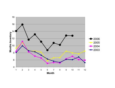
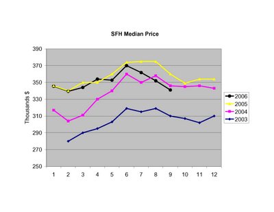
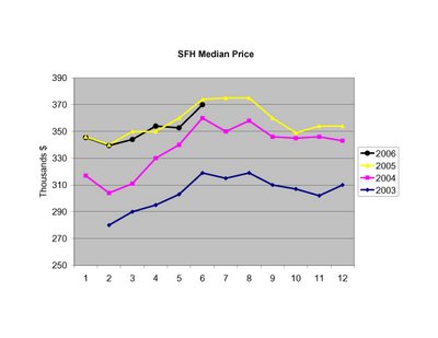
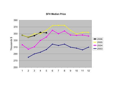
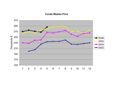
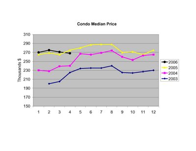
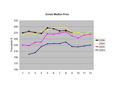
SFH prices for September are ~5% below 2005 levels, and ~1.5% below 2004 levels. The median price for sold condos was level with 2005.

While there's been noise recently about the market "bottoming," including a front page report in the Boston Globe today (link), the inventory picture does not show any signs of a market bottom:


The plot shows "months inventory," which is the ratio between total unsold inventory (SFH and condos) and total sales for the last 3+ years. While inventory level dipped briefly below 9 months in June of this year, the surge back above 12 months shows continued weakness relative to historical inventory/sales levels.

More details to follow...

Tuesday, September 26, 2006

August Market Wrap

MAR and the Warren Group reported similar August sales stats yesterday. Here are the MAR numbers plotted vs recent historical trends for SFHs and condos in Massachusetts.


Quotes of the month in reaction to these numbers:

1. From the MAR report (PDF here): "Today’s lower prices reflect the moderation in housing demand and rise in the inventory of unsold homes, which has led sellers to make modest price adjustments. With the economy still healthy though, double-digit price declines seem unlikely." (emphasis added) Remember, it was a little over a year ago (8/15/05, see previous post here) that MAR stated "we don’t anticipate any decline in prices in the foreseeable future, unless the economy slips into a recession.”

2. From the Boston Globe (here, and thank you for finally interviewing someone other than a realtor for comment): ``Things are not over in terms of the price declines," said David Iaia, a senior principal for Global Insight, a Lexington economics consulting firm. Iaia said the state's price declines would continue in 2007 and possibly into 2008, though it is difficult to predict. (emphasis added)

3. From the Boston Herald (here): Warren Group CEO Tim Warren said prices are dropping because “buyers are tasting blood, and they’re starting to get more aggressive (about) pricing.” (emphasis added)

Sunday, September 24, 2006

Historical Trends as a Guide to Future Price Movements

The past few weeks have brought a flurry of housing news and statistics, accompanied by a rapid acceptance that prices in many parts of the nation are falling. The peak for the current market cycle has clearly passed in Massachusetts, and the key question now is: how low do prices go from here? It's commonplace to hear widely disparate estimates; many bulls project a modest drop then resumption of price stability or growth, while bears offer more dire predictions of collapse.

To try to cut through all the hype and hysteria, I thought it would be useful to look at the longest running data series I could find to see where we now stand. I settled on the Massachusetts Association of Realtors compilation of average sale prices for SFHs and Condos from 1968 to 2005 (the numbers are available as a PDF here). Note this data series differs slightly from other metrics in that it reports mean prices, not median, and SFH and condo prices are combined.

To filter out inflation effects, I adjusted prices using the CPI-U inflation numbers for the corresponding years (available here). I then indexed prices to a starting value of 100 for 1968, and plotted the the average real price (inflation adjusted for all subsequent years). Before looking at the plot, consider this point: if housing prices change proportionately with inflation, the plot would be a flat line. Clearly it is not. Periods of positive slope indicate prices increasing faster than inflation, while a negative slope implies prices that are rising more slowly than inflation, or falling.

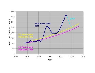
It is commonly observed that housing prices over the long term rise ~1-2% faster than inflation. This historical relationship derives largely from the fact that incomes in America have, over the long term, risen faster than inflation. Hence, a higher standard of living, and the ability to pay more for housing. To help visualize what the long term trend might look like in an ideal world, I've included trendlines to show 2% real annual increases indexed to 1968 and 1973. You could do the same trendline starting with any year.

If you believe in a fundamental relationship between income and home prices (as opposed to a "new paradigm" of ever increasing home prices uncoupled from income) and reversion to the mean, then clearly current prices are far from equilibrium trendlines (although interestingly, not as far in % terms as we were in 1986-7). Prices would need to drop ~36-42% in real terms to bring us immediately back into the long term trend range.

A more likely outcome is that prices will fall over the next few years, while inflation and wage gains will help to correct the current imbalance. I've plotted one such scenario in light blue, assuming CPI-U inflation of 4% in 2006, then 3% each year out to 2010, and nominal price declines of 2%, 6%, 6%, 3% and 0% from 2006-2010. The combination yields real price drops of 6, 9, 9, 6, and 3% over the same years, and brings the price index down 31% over 5 years and into rough equilibrium with the long term 2% real trendline (indexed to 1973). I'll be the first to say these are only rough guesses based on the previous down-cycle, so feel free to quibble with my predictions. What I think is more important is the visual impression this plot gives of the general scope and timing of the current price cycle, and the time and price changes that will likely be needed to correct the current imbalance.

Note: There is nothing magical about the 2% trendline indexed to 1973, and no reason to believe prices couldn't drop through it as they did in the late 1970's. I just find it intriguing that prices after the last cycled dropped almost exactly to this trendline in 1996-7 before beginning the latest up-cycle.

Tuesday, August 29, 2006

Sales and Inventory Trends

As detailed in the previous post, sales in MA in July were weak across the board. For comparison, here are the monthly sales figures (up to July) for the last 5 years:

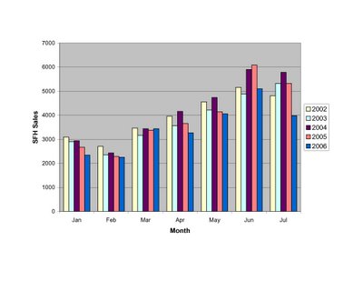
The slowdown in SFH sales appears to be accelerating this summer.


Monthly condo sales were at record levels as recently as the 1st Q of 2006, but this summer sales have slowed rapidly, retreating to ~2003 levels in July.

Months inventory for the market as a whole continues to paint a picture of weakness, although the surge in inventory from 2005 levels has slowed. The bigger problem now is with slowing sales.

Wednesday, August 23, 2006

July Market Wrap

This week saw the release of July market stats for Massachusetts.

First up, data from the Warren Group (reported here):
SFH sales: 5,070(down 27% YOY)
SFH median price: $339,000 (down 6.1% YOY)
Condo sales: 2,692 (down 23.5% YOY)
Condo median price: $277,000 (down 4.2% YOY)

Next up, data from the Massachusetts Association of Realtors (reported here):
SFH sales: 3,982 (down 25.3% YOY)
SFH median price: $361,750 (down 3.5% YOY)
Condo sales: 1,883 (down 21.4% YOY)
Condo median price: $276,000 (down 4.1% YOY)

For those graphically inclined, here are the MAR price and inventory data relative to recent history. First up, SFH numbers:


(Note the inventory numbers reflect corrections for June by MAR).

Here are the condo figures:


I'll post the sales graphs soon, along with the trend in months inventory. Needless to say, the numbers for July were unquestionably weak. The "soft-landing" scenario of moderate price growth seems to have suffered a rapid demise. The question of the day now is: how far down will prices go?

Sunday, August 20, 2006

2nd Quarter Weakness

According to the Massachusetts Association of Realtors, statewide 2nd Quarter sales (April, May, June) of SFHs fell sales fell 10.6%, and condo sales fell 8.9% year over year. Median price declines were more modest, down 1.3% for SFHs and essentially flat for condos YOY. The Warren Group reported similar numbers, with SFH sales off 11.7%, condo sales off 10.9%, SFH prices off 2.9% and condo prices inching up 0.7% (details here). For a recent historical perspective, here are the MAR reported YOY % changes in median price and sales for the last 8 quarters.


The SFH sales market began to contract in the 2nd Quarter of 2005. This quarter the Condo market joined in the contraction.

Median prices for SFHs and Condos are now clearly at or below year ago levels.

Tuesday, July 25, 2006

June Market Wrap

June numbers were released today by the Massachusetts Association of Realtors (pdf here). First up, prices:

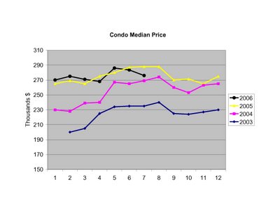
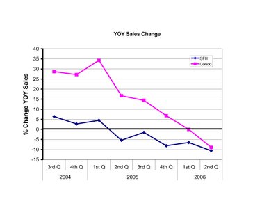
Prices for both SFHs and Condos were DOWN ~1% compared to the same month last year. Sales were also off, 17% for SFHs and 14% for Condos:


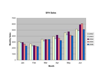
Reported inventory numbers seem absurd:


Any explanations? Houses flooded by the spring rains? Sellers giving up?

Sunday, July 23, 2006

Slow Burn

There seems to be some consternation among local market observers that price drops haven't yet proved to be "huge" (see example here from this weekend's Boston Globe). Let's try to put the current emerging downturn into perspective. Prices in MA typically plateau in the summer, decline somewhat in the fall/winter, then surge strongly in the spring. Here's a plot of what has happened to sales prices since last year's peak (August 2005) according to MAR. 
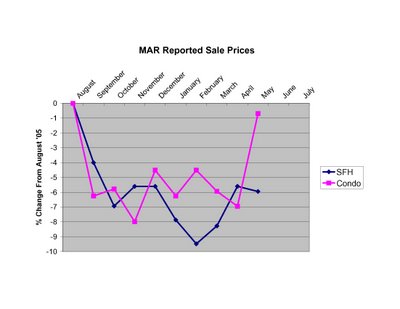
Clearly prices are down from the peak, even though condo prices made a strong move recently. But is this spring exhibiting typical strength? The short answer is NO. From the peak in '03 to May of '04, SFH prices went UP ~7% and condo prices went UP ~12%. From the peak of '04 to May of '05 SFH prices went UP ~1% and condo prices went UP ~2%. From last year's peak to this May, SFH prices are DOWN ~6% and condo prices are DOWN ~1%. Not huge, but clearly negative.

Given the fact that only 10% of homes on the market are selling in a typical month, we should also look at asking prices to get a more complete picture. It's been nearly a year since web tracking of asking prices and inventory for the Boston area have been available (see here). While this is only one segment of the MA market it is revealing to see the price declines broken down by quartiles. Clearly the highest priced properties (75th %ile) have suffered the most so far. Note: I averaged the readings for each month to provide a smooth trendline.
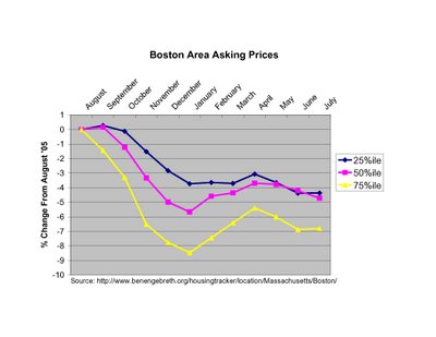
While the spring bounce in prices is apparent from the plot, asking prices peaked rather meekly in April well below last August levels, and asking prices have since returned to a downward trajectory. This is NOT a strong sign for prices for the remainder of the summer and the rest of the year.

How does the current weakness compare to previous experience? Plotted below are the nominal and real (inflation adjusted) percent changes in average prices in MA from 1988 to 1995.
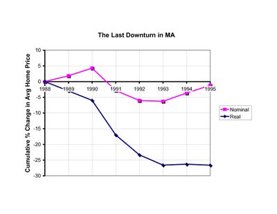
Note that while this previous market shakeout is regarded by many as a "housing bust", the biggest nominal decline in prices in a single year was only ~7% (from 1990 to 1991). Notice also that once the market started slowing the biggest declines took time (2-3 years) to develop, and the recovery was agonizingly slow. Food for thought when you hear talk of soft-landings and impending market rebounds.

Monday, July 10, 2006

May Sales Volume Stats

As requested by a reader, here are the monthly sales data for Jan-May as reported by the MAR. For comparison, the numbers are plotted relative to the past 4 years. As you can clearly see, monthly SFH sales have been gradually slowing for the past few years. So far this year only March 2006 escaped being weaker than each of the past 4 years.
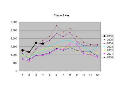
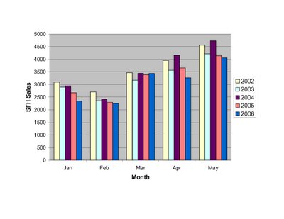
In contrast, Condo sales have continued to set records until the past couple months. A momentary blip, or worrying trend?

To see how the modest flattening and/or slowing of sales compares with the the growing inventory of properties for sale, see the previous post here. Clearly the number of properties entering the market has FAR exceeded the number of buyers during the last year plus, even though sales remain at or near recent peaks.

Tuesday, June 27, 2006

May Market Wrap

Both the MAR and the Warren Group released Massachusetts sales and price data in the last couple days. Before plotting the MAR numbers with historical data, here's a summary of the numbers.

Warren Group data (reported here and here):
May SFH sales: 5,208 (down 5.1% YOY)
May SFH median price: $331,000 (down 4% YOY)
May Condo sales: 3,037 (down 7.8% YOY)
May Condo median price: $285,000 (up 1.8% YOY)

Massachusetts Association of Realtors data (reported here):
May SFH sales: 4,055 (down 2.9% YOY)
May SFH median price: $352,700 (down 1.2% YOY)
May Condo sales: 2,113 (down 1.2% YOY)
May Condo median price: $286,000 (up 2.5% YOY)

I'm not sure what to make of the conflicting data. The Warren Group has a more complete data set that includes FSBOs, estate sales, foreclosures, and other transactions that don't show up on the MLS. Can any reader clarify whether sales of new SFHs and Condos are reported in MLS? If not, that may account somewhat for the much lower sales volume from MAR. Also the weaker price trends in the Warren Group report might be a reflection of some discouting done by builders to clear new SFH and condo inventory.

Unfortunately I don't have the historical data series from the Warren Group, so I will continue to plot MAR data below. First up, historical median prices for SFHs:

SFH inventories continue to climb:

Condo median prices recovered in May to post a small gain:

Meanwhile, Condo inventories leveled off last month:


While inventories are up strongly from last year, the Warren Group reports that SFH sales are down 9.3% so far this year (relative to 2005), and Condo sales are off 5.5% relative to last year.

In my opinion, the fascinating number to watch next month wil be SFH median prices. If prices don't increase from May's $352,700 to greater than $360,000, we'll not only be well below 2005 levels, we'll be back to 2004 price levels.

Monday, June 26, 2006

Abandoned?

Recent posts from the Bubble Meter and Matrix blogs have chronicled the seeming abandonment of a few "bubble blogs." Based on the dearth of recent posts here, Bubble Meter speculated this blog might be heading toward the same fate. Well, thanks for the kick in the pants.

I certainly haven't added much analysis over the past three weeks to the often contradictory news coming out about the MA housing market. But I'm not one to spend my time repeating what readers can find elsewhere in the MSM and Blogosphere, especially when there are fine links right here on the page. There's no shortage of coverage of our local market, thanks to the efforts of Boston Bubble, Counter Intelligence, Boston Real Estate Blog and others. And if it's passionate discourse from local market observers you want, the Boston.com message board is often insightful, hilarious, and maddening in the span of a few messages.

But be assured, while posts may be infrequent during the summer months, I will continue to post observations, data, and links as time and inspiration permit. And nothing motivates like a fresh batch of market stats to plot, discuss, and de-spin. The Warren Group released May sales and price data today (here), and MAR releases their report tomorrow. So tune in then for a full breakdown of the numbers.

Saturday, June 03, 2006

Inventory up + sales down = ?

A few months back I showed how the inventory of homes for sale relates to changes in median sale prices (orginal post here). I'd like to update that post with the most recent market numbers, and talk about how current trends may shape this dynamic relationship.

Below is a plot of the months inventory recorded in each month of the past 3+ years. I calculated this number by adding up the number of SFH and Condos on the market, and divided by the number of sales recorded that month by MAR. As you can see, there is a seasonal pattern to the numbers, with months inventory dropping to its lowest levels during the summer peak buying season. What is also clear is the decisive break that began last fall and continued into 2006. I've also included the average months inventory for each year (dashed lines), and a guesstimate I made back in February of what I think the 2006 average may look like based on past years behaviors.

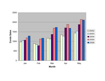
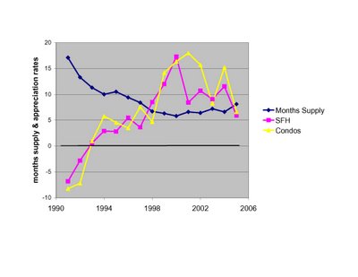
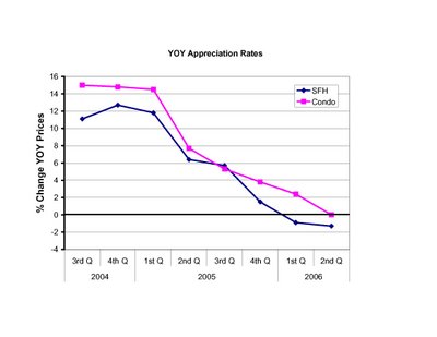
Now going back further in time and using the average months inventory for each of the past 15 years, I've plotted the appreciation rates for SFHs (blue) and Condos (pick) as a function of the average inventory for each year. There is a clear inverse relationship between inventory and appreciation rates. To emphasize the shift in the market, I've included dashed lines showing the inventory levels for 2004, 2005, and the guesstimate for 2006. The yellow lines connect the 2004 and 2005 data points, showing the downward trajecory that began last year.

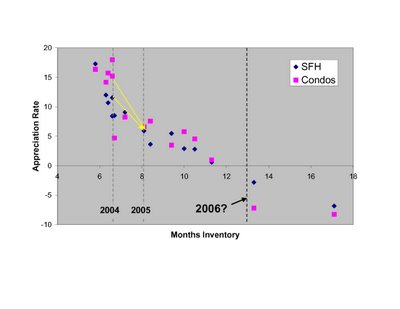
As some have commented, even as inventories have ballooned over the past year sales have remained historically robust in MA, especially for condos. To some this is a sign of a strong but more balanced market. To others this is an ominous trend, as any slip in sales could further shift the market balance, which is already adding inventory at a steep rate.

Last month may signal the beginning of the next phase of the market, as sales weakened in the heart of the spring selling season. Plotted here are the sales in each month for the past 6+ years, both for SFHs and Condos.
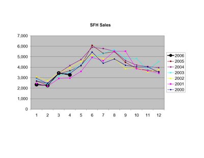
Clearly the future is not something we can predict with 100% accuracy. But the data I've presented here, in the context of historical market behavior, indicate to me a high likelihood that prices will continue to drop. The RE market is incredibly complex and has a number of interrelated moving parts (population changes, income changes, mortgage rates, 2nd home and investor activity, rental prices, new construction, etc) but sometimes the message from supply and demand is all you need to know. This, I believe, is one of those times.

Thursday, June 01, 2006

Rents going nowhere in Boston?

In an article at CNN/Money entitled "Rents heading up in '06" I found these numbers for the most expensive rental cities in the US:

City - Avg rent - % increase(12 mos. ending Mar 31)
1. New York* - 2,400 - NA
2. San Francisco - 1,669 - 10.3%
3. San Jose - 1,429 - 8.6%
4. Los Angeles - 1,422 - 6.8%
5. Orange County - 1,393 - 8.1%
6. Boston - 1,350 - 1.2%

Only one other city in the top 20 had a rental increase lower than Boston's. Keep in mind inflation was running ~3-4% over the past 12 months, so rents in Boston actually decreased over the last year in real terms.

Will this performance change anytime soon? I for one doubt it. Too much new construction in the pipeline (see here) for a region with flat or declining population (see here), and don't forget about unsold houses/condos that will end up back on the rental market eventually.

Friday, May 26, 2006

April Market Wrap

April numbers came out this week from both the Warren Group (covered here in the Globe and here in the Herald) and the MAR (here). Given the historical numbers available from MAR, I'll continue to post updates based on their market stats.

The biggest surprise was the drop in sales from both last year and, shockingly, from last month. Typically sales rise throughout the spring, but that pattern was disrupted this year. SFH sales dropped 10% from last year and 5% from last month. Condo sales dropped 10% from last year and 3% from last month. The drop in condo sales is especially unexpected, given the strength in condo sales until now.

SFH prices recovered somewhat, and were basically flat from last year (up 0.3%).

Condo prices took it on the chin, and were down 2.5% compared to last year. The first drop in 88 months. The condo price chart is suddenly exhbiting an ominous trend.

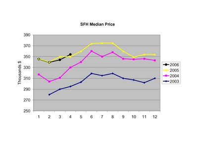
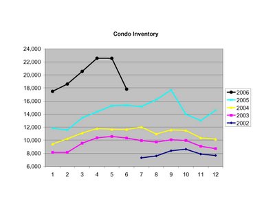
The unsold inventory of SFHs continues to surge...

While condo inventories continue to build at an accelerating rate.

Below I've plotted the Months Inventory of combined SFHs and Condos to give a unified picture of the market's current state. Keep in mind MAR puts a balanced market at ~7.5-8.5 months inventory.

To put the surging inventory levels into historical perspective, here's the yearly appreciation rates and inventory for the last 15 years. Notably, inventory levels above 12 months have historically been associated with declining prices.