Historical Trends as a Guide to Future Price Movements
The past few weeks have brought a flurry of housing news and statistics, accompanied by a rapid acceptance that prices in many parts of the nation are falling. The peak for the current market cycle has clearly passed in Massachusetts, and the key question now is: how low do prices go from here? It's commonplace to hear widely disparate estimates; many bulls project a modest drop then resumption of price stability or growth, while bears offer more dire predictions of collapse.
To try to cut through all the hype and hysteria, I thought it would be useful to look at the longest running data series I could find to see where we now stand. I settled on the Massachusetts Association of Realtors compilation of average sale prices for SFHs and Condos from 1968 to 2005 (the numbers are available as a PDF here). Note this data series differs slightly from other metrics in that it reports mean prices, not median, and SFH and condo prices are combined.
To filter out inflation effects, I adjusted prices using the CPI-U inflation numbers for the corresponding years (available here). I then indexed prices to a starting value of 100 for 1968, and plotted the the average real price (inflation adjusted for all subsequent years). Before looking at the plot, consider this point: if housing prices change proportionately with inflation, the plot would be a flat line. Clearly it is not. Periods of positive slope indicate prices increasing faster than inflation, while a negative slope implies prices that are rising more slowly than inflation, or falling.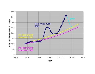 It is commonly observed that housing prices over the long term rise ~1-2% faster than inflation. This historical relationship derives largely from the fact that incomes in America have, over the long term, risen faster than inflation. Hence, a higher standard of living, and the ability to pay more for housing. To help visualize what the long term trend might look like in an ideal world, I've included trendlines to show 2% real annual increases indexed to 1968 and 1973. You could do the same trendline starting with any year.
If you believe in a fundamental relationship between income and home prices (as opposed to a "new paradigm" of ever increasing home prices uncoupled from income) and reversion to the mean, then clearly current prices are far from equilibrium trendlines (although interestingly, not as far in % terms as we were in 1986-7). Prices would need to drop ~36-42% in real terms to bring us immediately back into the long term trend range.
A more likely outcome is that prices will fall over the next few years, while inflation and wage gains will help to correct the current imbalance. I've plotted one such scenario in light blue, assuming CPI-U inflation of 4% in 2006, then 3% each year out to 2010, and nominal price declines of 2%, 6%, 6%, 3% and 0% from 2006-2010. The combination yields real price drops of 6, 9, 9, 6, and 3% over the same years, and brings the price index down 31% over 5 years and into rough equilibrium with the long term 2% real trendline (indexed to 1973). I'll be the first to say these are only rough guesses based on the previous down-cycle, so feel free to quibble with my predictions. What I think is more important is the visual impression this plot gives of the general scope and timing of the current price cycle, and the time and price changes that will likely be needed to correct the current imbalance.
Note: There is nothing magical about the 2% trendline indexed to 1973, and no reason to believe prices couldn't drop through it as they did in the late 1970's. I just find it intriguing that prices after the last cycled dropped almost exactly to this trendline in 1996-7 before beginning the latest up-cycle.
2 comments:
DT: this is great analysis and a useful model.
The thinking here suggests another level of detail, running a graph that tracks purchasing power against housing prices, where purchasing power is a function of mortgage rates and household income.
Buttressing your argument is the fact that mortgage rates at your (assumed) equiilbrium point of 1968 were not far from where they are today.
It is worth mentioning that income is a more difficult input, since the home ownership rate in the state is lower than in other states.
But the graph does not account for an undeniable and crucial secular change in the Massachusetts housing market between 1968 and 2006: restricted supply, especially of new or recently renovated housing.
In the 1960's and 1970's Massachusetts was a state with robust building - check out the number of permits pulled in those decades on www.census.gov. But much of this building occurred in the suburbs, where whites were moving in droves. Meanwhile in the city, because of rent control (1972-1997), owners deferred maintenance on a significant percentage of the housing stock in that area. As whites left, landowners were less likely to renovate housing for their (lower income) minorities.
More to the point, for a host of reasons a range of policies were adopted throughout the state that restricted development - zoning codes, environmental regulations, affordable housing requirements on market-rate developments, etc. that have resulted in much higher construction and land costs than in other states. The result? Scarcity of new or like-new homes at affordable prices.
As an example, the vast majority of buildings in Boston, Cambridge, Somerville, etc. are non-conforming based on today's zoning laws. You can't build what you see - density limits, floor area ratio limits, minimum lot size per dwelling unit rules, parking and open space requirements, etc. mean that future construction will be limited, and housing scarce - which means that the ratio of price to purchasing power will remain elevated over 1968 levels.
Put another way, assuming continued job and population growth over time, housing prices will not stay below replacement cost, since builders will not continue to build and sell at a loss.
Barring major changes in the zoning codes - a highly unlikely event - building will remain highly constrained and more costly in this decade (relative to incomes) than in 1968, when building was easy.
In my view, DT's argument holds if we had a more deregulated market for building. But we don't. So... I think that prices will continue to decline only in the wake of exogenous factors that reduce demand (eg. an increase in mortgage rates or decrease in income or job growth) relative to supply.
Good logic on this chart, but i can't replicate it for some reason, not sure if i'm in error or not but if you can explain a bit more of the calculation I would appreciate it.
Post a Comment