Homeowners or Homedebtors?
The real estate industrial complex and our elected leaders continue to extoll the virtues of homeownership. Certainly it's a laudable goal to own one's home. But while headlines trumpet homeownership rates (the percentage of households that pay a mortgage or own outright, rather than rent), they do not typically address how much of our home's we actually own. The following chart (from Barron's Econoday courtesy of The Big Picture: Real Estate , 4/17/2005) shows that Owners Equity (as a percent of home value) has declined markedly over the past 25 years.
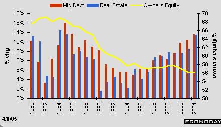
Notice that even over the last few years during a time of strongly increasing home prices, owner equity has continued to decline. How? The housing ATM has induced the continued growth of mortgage debt (the red bars) at a faster rate than real estate values have grown (blue bars).
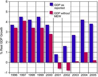
This borrowing has been a major contributor to GDP over the past few years. Calculated Risk has used the Goldman Sachs estimate that ~2/3 of mortgage equity extracted ends up fueling consumption to calculate US GDP over the past 10 years with and without the housing ATM.
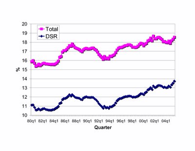
While the continued binge of borrowing has fueled consumption and GDP growth, it has created unprecendented indebtedness in US consumers. The Federal Reserve tracks several metrics of debt. Among these is the Debt Service Ratio (DSR), which is an estimate of the ratio of debt payments to disposable personal income. Debt payments consist of the estimated required payments on outstanding mortgage and consumer debt. The financial obligations ratio (denoted Total in the plot below) adds automobile lease payments, rental payments on tenant-occupied property, homeowners' insurance, and property tax payments to the debt service ratio. Both data series plotted quarterly over the past 25 years tell the story of escalating consumer debt.
3 comments:
Right on Brotha. You hit the nail on the head. Wait 'em out until '07 and then come in and scoop up a deal like a vulture on a fresh roadkill. Two more rate increases by the fed coming up. In the bag as they would say... next big talk will be how many more to follow!!
How would you respond to this anonymous quote from a real estate agent friend of mine? Importance is bolded.
I just got back from a seminar that was showing where inflation is currently, 3.5 that the number the Fed won’t let it get to is 5.0, that the Fed will raise interest rates over the next few months but the effect on mortgages will be minimal.
Thanks for this interesting data.
According to the first chart, home equity has changed only slightly, from 58% to 56% over the last 10 years. That's not a large change, and thus in itself does not indicate any greater probability of a housing correction or any greater threat from a housing correction.
The second chart is frightening, but is also backward looking. Housing price gains drove consumer spending the last few years, cushioning the blow from last year's hurricanes and the jump in oil prices. Whether the economy will prove resilient against a correction in housing prices this year cannot be predicted by anyone.
The third chart shows overall leverage increasing from 17% to 18.5% over the last 10 years, and from 18% to 18.5% over the last 20 years. Yawn.
There may be compelling reasons to worry about a housing correction, but these charts don't really strengthen the argument.
Again, all wonderful information. Keep up the great work!!!
Post a Comment