May Market Wrap
Both the MAR and the Warren Group released Massachusetts sales and price data in the last couple days. Before plotting the MAR numbers with historical data, here's a summary of the numbers.
Warren Group data (reported here and here):
May SFH sales: 5,208 (down 5.1% YOY)
May SFH median price: $331,000 (down 4% YOY)
May Condo sales: 3,037 (down 7.8% YOY)
May Condo median price: $285,000 (up 1.8% YOY)
Massachusetts Association of Realtors data (reported here):
May SFH sales: 4,055 (down 2.9% YOY)
May SFH median price: $352,700 (down 1.2% YOY)
May Condo sales: 2,113 (down 1.2% YOY)
May Condo median price: $286,000 (up 2.5% YOY)
I'm not sure what to make of the conflicting data. The Warren Group has a more complete data set that includes FSBOs, estate sales, foreclosures, and other transactions that don't show up on the MLS. Can any reader clarify whether sales of new SFHs and Condos are reported in MLS? If not, that may account somewhat for the much lower sales volume from MAR. Also the weaker price trends in the Warren Group report might be a reflection of some discouting done by builders to clear new SFH and condo inventory.
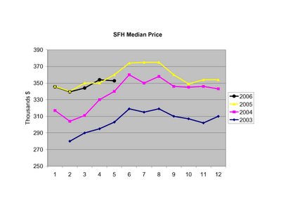
Unfortunately I don't have the historical data series from the Warren Group, so I will continue to plot MAR data below. First up, historical median prices for SFHs:
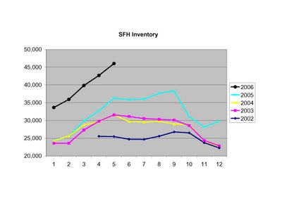
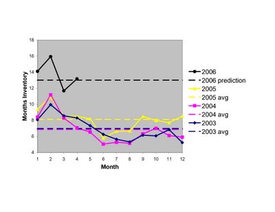
SFH inventories continue to climb:
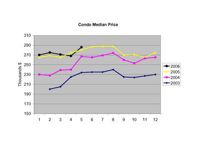
Condo median prices recovered in May to post a small gain:
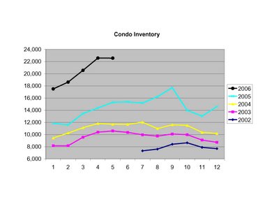
Meanwhile, Condo inventories leveled off last month:
While inventories are up strongly from last year, the Warren Group reports that SFH sales are down 9.3% so far this year (relative to 2005), and Condo sales are off 5.5% relative to last year.
In my opinion, the fascinating number to watch next month wil be SFH median prices. If prices don't increase from May's $352,700 to greater than $360,000, we'll not only be well below 2005 levels, we'll be back to 2004 price levels.
 Now going back further in time and using the average months inventory for each of the past 15 years, I've plotted the appreciation rates for SFHs (blue) and Condos (pick) as a function of the average inventory for each year. There is a clear inverse relationship between inventory and appreciation rates. To emphasize the shift in the market, I've included dashed lines showing the inventory levels for 2004, 2005, and the guesstimate for 2006. The yellow lines connect the 2004 and 2005 data points, showing the downward trajecory that began last year.
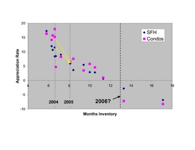 As some have commented, even as inventories have ballooned over the past year sales have remained historically robust in MA, especially for condos. To some this is a sign of a strong but more balanced market. To others this is an ominous trend, as any slip in sales could further shift the market balance, which is already adding inventory at a steep rate.
 Clearly the future is not something we can predict with 100% accuracy. But the data I've presented here, in the context of historical market behavior, indicate to me a high likelihood that prices will continue to drop. The RE market is incredibly complex and has a number of interrelated moving parts (population changes, income changes, mortgage rates, 2nd home and investor activity, rental prices, new construction, etc) but sometimes the message from supply and demand is all you need to know. This, I believe, is one of those times.